
What it Took to Make This Book
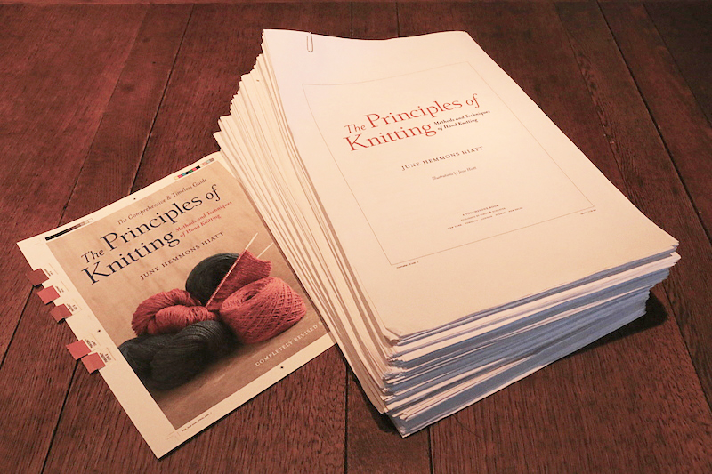
The final stack of proof sheets and the color test for the cover.
A big book like The Principles of Knitting involves a great deal more than an author writing alone at a desk. Editing, preparation of graphics, and bringing all the pieces together into a layout, with everything in the right place, is a major endeavor. It requires an investment on the part of a publisher that far exceeds the cost of printing and binding, or conversion of the material for a digital edition.
Normally a book is finished before it goes into production, but we decided to get started early because this one was not only big, but complicated. I had finished about half of the rewrite when I began working with Senior Editor, Michelle Howry at Simon & Schuster. Every chapter went back and forth between us for editing two or three times before we were satisfied.
And while I was still writing new chapters, the ones we thought were done went to Wilstead & Taylor, a wonderful small publishing design firm near where I live; they would be responsible for making a book out of manuscript pages.
The copy editors there were not only meticulous in checking grammar and punctuation, but as knitters, they also made sure instructions were accurate and provided feedback about the clarity of the instructions and text.
Pages would come back to me marked up with changes and queries: “Did you mean to say nearside or farside in Step 2?” “Are there two stitches on the right needle or three in Step 4?” “Is this cross-reference correct?” “I’m confused by this — do you mean…?”
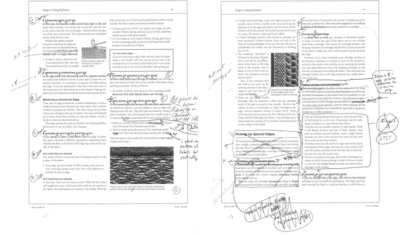
What proof pages look like when marked up by copy editors
One of the major challenges we had was to keep the book from becoming even bigger than it is, which required some compromises. If these things hadn’t been done, the book would have been well over 800 pages and even heavier.
* We reduced the size of illustrations as much as possible without making them difficult to understand.
* Next, I took every “the” out of the instructions; needless to say this distressed the editors at first, but it saved a lot of space and I came to prefer it that way because it pared every line down to the essentials.
* And finally, I relied heavily on cross-references to avoid repetition in the text. To save space we even took out the page numbers that would normally be included in a reference (and there were so many of them on some pages it was visually distracting). We hoped it would not be too annoying for a reader to turn to the Index to look things up. I don’t think this is much of a problem for readers of the book, but suspect it might be with the digital edition because searching can be slow.
While I kept writing and working with editors on the text, my friend Muriel Sarik and my son Jesse helped prepare over 900 pieces of artwork.
Muriel scanned in the hand drawn originals from the first edition and cleaned up the digital versions; ink splotches were erased, borders deleted, and they were straightened, cropped, sized, and named.
About 20 percent of the original artwork had been damaged or lost, and some needed correction. New material required new graphics that looked like the originals, and all of this was Jesse’s to do in Illustrator.
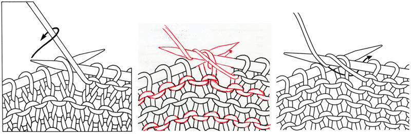
Revising a Knit Garter Stitch drawing into one for Left Hand Purl in Stockinette. Original on left, my red ink corrections in the center, and the finished result on the right.
He was also responsible for digitally enhancing many of the original photographs, the quality of which were less than ideal. If an original swatch was still available, it was rephotographed; often I had to knit a new one. Images had to be obtained from museums; they were frequently old and often dark, and needed to be corrected, cropped, and sized.
As each chapter was done, I brought text, graphics, and captions together in a rough layout using a program called InDesign, so Wilstead & Taylor would know exactly how everything went together. They also began to develop the new book design and consulted with me on all decisions regarding fonts, ink color, page layout, paper, and cover art.
As the book neared completion, several deadlines were missed and exhaustion set in. A change in one place often meant a change to a cross-reference and to the Index, or worse, a rewrite of material that we thought was done. Corrections were still being made in the week before the book was due at the printer (for those mistakes we did not catch, see the Errata page).
During the last few days, the staff at Wilstead & Taylor checked to make sure that each line was in place, the layout was just right, the headers and footers were accurate, and all the images and their captions were correct and properly positioned. They sat me down at a desk and had me approve every single detail on every single page.
It is important to understand this represents truly lavish support for a book on the part of a modern publisher. Costs are being cut to the bone due to discounted book prices, and normally a manuscript will often have just one reading by a copy editor; inevitably errors slip through. Page layout, paper choice, and cover design are done as quickly as possible by the production department and the author is rarely consulted on any of this.
Fortunately, Simon & Schuster believed in this book, understood how complex and detailed it was, and that it was important to get it right. And the fine people at Wilstead & Taylor produce books the old-fashioned way, with care and attention to detail. They both have my deepest gratitude.